top of page

Unit Trusts

Redesigning the trading website

DURATION

Jun 2021 - Nov 2021
(6 months)

TEAMS

2x UXUI designers
1x Project Manager
1x Business Analyst
1x Scrum Master
8x Developers
2x QA

MY ROLE

Senior UXUI DesignerUX design, UI design, Information Architecture, Prototyping, Usability Testing

TOOLS

Sketch, Invision, Overflow

Background

Our design team worked remotely for the largest multinational bank in Hong Kong and collaborated with the product and development teams from the UK, India, Poland, China, etc.

The bank wanted to expand its online banking services in the country in Western Asia, where trading Unit Trusts were not available. We designed a responsive website in three viewports (Desktop, tablet, mobile) with enhancements from Hong Kong’s live version.

1.png
Goals
  1. Solve customer pain points from the existing design in Hong Kong

  2. Update UI with latest brand style

  3. Create a scalable template for other investment products and markets

  4. Apply accessibility standard

  5. Verify the design with usability test

Customer pain points

The bank conducted usability testing and research interviews for trading Unit Trusts on mobile before our project. Both mobile and desktop designs shared the same content, the following pain points also applied to desktop users in Western Asia:
 

  1. Less experienced investors were not well supported and guided. With a lack of easily accessible definitions for complex terms and features, they were not confident enough to proceed.

  2. Important information was hidden on the fund detail page, which were important for making investment decisions

Market research

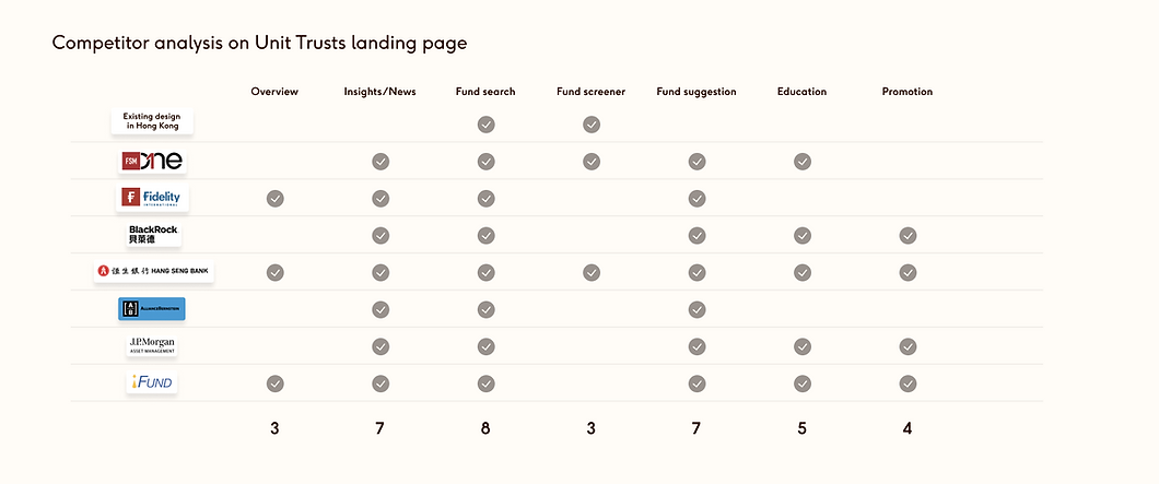
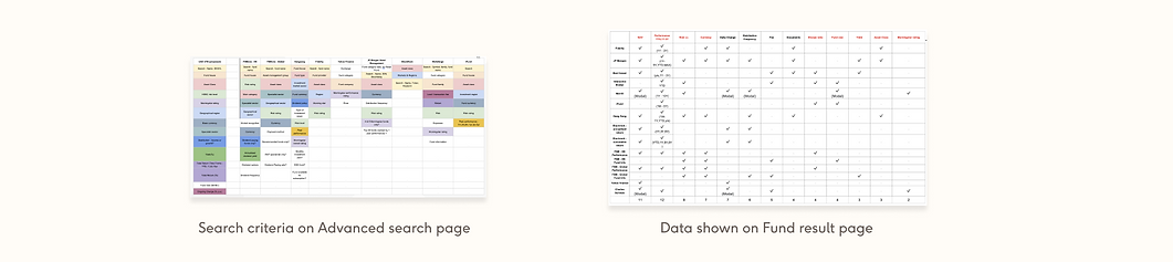
We conducted serval competitor analysis by sections to understand your competitors' strengths and weaknesses, and to identify gaps in the marketplace. The sections were included Unit Trusts landing page, fund search page, fund result page, and fund details page. Here were the takeaways:
 

  1. The landing page should be more informative to include fund recommendations and news.

  2. Fund education section was useful to support less experienced investors.

  3. The fund detail page needed a simpler information architecture, as the loaded and disorganized content overwhelmed users.

  4. Most competitors did not support mobile users very well, and it was the potential for our projects while there was an increasing amount of mobile users.

  5. A simpler user experience is needed to find important information that is valuable for users to make investment decisions.

3.png
4.png
MVP

Based on the insights from previous user testing and market research, I conducted workshops and sketching sessions with the product team to define a sitemap for Unit Trusts. We prioritized the core functionalities and allocated the tasks for MVP (Minimum Viable Products):
 

  • Unit Trusts landing page

  • Fund screener

  • Fund details page

  • Transaction pages

  • Order status page

Wireframe & Design

The new design of Unit Trusts has not been fully developed and launched yet. Here I showed the low-fidelity wireframes that I drew for some pages with variations in MVP launch.

5.png
Validating

Remote usability testing was conducted with the UX agency in the UK. We worked closely to define the Research Brief with research objectives and criteria for target audiences. I provided a clickable prototype for testing.

Feedbacks from usability testing of MVP

  • The service was well received by all participants

  • All the information that participants said was critical to investment-making decisions was found on the fund details page.

  • The fund tables successfully allowed participants to make effective assessments between the funds.

  • However, participants wanted more information and explanation on terms, especially for less experienced investors

Working with developers

We worked with 8 developers from Poland to develop the designs. Final UI designs were uploaded to Invision for developer specs and measurements. Developers could see and reply our feedback from UI defects on Invision.

We also used Storybook for keeping all UI components. We viewed the different states of each component, and interactively developed and tested components.

7.png
Results & takeaways
  1. Check in with junior regularly. We set goals and divided the tasks daily. We also set expectations from the start. I valued the transparency and trust within the design team.

  2. Ask when things were not clear to me. When working with teams around the globe, we faced some language barriers and cultural differences. I learned to ask actively and make all the tasks clear to everyone.

  3. Concentrate on my core message. In this project, we had to present our designs with in-house designers and get their approval regularly. Each session was about 15 minutes long. Prioritizing and focusing on key points were necessary.

Other project

Hero.png
Tandem HK
A mobile app for the UK challenger bank in Hong Kong

© 2024 by Ashley Fung. All rights reserved.

  • LinkedIn
  • Instagram
bottom of page